Posts

Showing posts from February, 2018

H&M Close the Loop- Shot analysis
Image
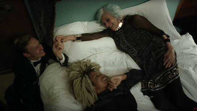
This shot is from a high angle to show how the younger people look up to the older lady because she is not afraid to wear things that socially people do not accept as easily. There are all dressed in quite posh clothes, which means this particular shot is aimed at higher class people, and showing that no matter how much money they have, they can still shop at H&M. The two younger people are below the older woman who is lying on a bed, and it represents many generations coming together, as it doesn't matter what age you are, you can still shop in H&M. The voice over says "Wear a short skirt after 40", and it is saying that again, age doesn't affect the clothes you are allowed to wear.  This shot is at a low angle to show how this woman is superior as she is confident enough to go out into everyday life wearing whatever she wants. The fact that she is wearing all these out there clothes to a small corner shop shows that H&M wants people to be ...

H&M- Bring it On: Textual analysis

How does the video for H&M's Bring it on campaign promote H&M as an ethical fashion retailer? - Refer to the video with close textual analysis. - Use key terminology. The camera   This is used to show the ethical aspect of this promotional video through the use of the hand held filming technique. This makes the shots have a more realistic feel which makes the video relatable. This also makes the video feel more rough, as if the video is the clothes themselves, and you are looking at it in a different perspective. There are c lose ups to emphasize the importance of the clothes, even if they are damaged, and to show how no matter what condition the clothes are in, you can still recycle them. The zoom again is used to show how crucial recycling clothes is, and it is used to get the audience to take notice, and think about how they can recycle their unwanted clothes. The technique of  shot reverse shot is used to show a  higher level of depth in the video, and...

Final draft of Posters

Image
Final draft I have made these posters for my final draft. The first one has my model standing on a tree trunk looking into the distance. I have edited it in a way that makes the picture brighter and less dark, but if I was making this poster again, I would make sure that when I re shoot this picture l, you are able to see the clothes such as the t shirt more clearly. I would do this as the clothes are supposed to be the centre of the poster, so I need to make them be more of the focus. I would also have it so that she is at a right angle as the picture looks slightly odd because she is tilted slightly. The logo is in a different place in both the pictures, so I need to frame them better if I retook them so that there is continuity. The second poster is of my model in an archway of trees. I like the perspective and how the path follows upwards, and I believe that if I have my model more to the left, the path would flow nicely in the picture. I again made the picture brighter ...